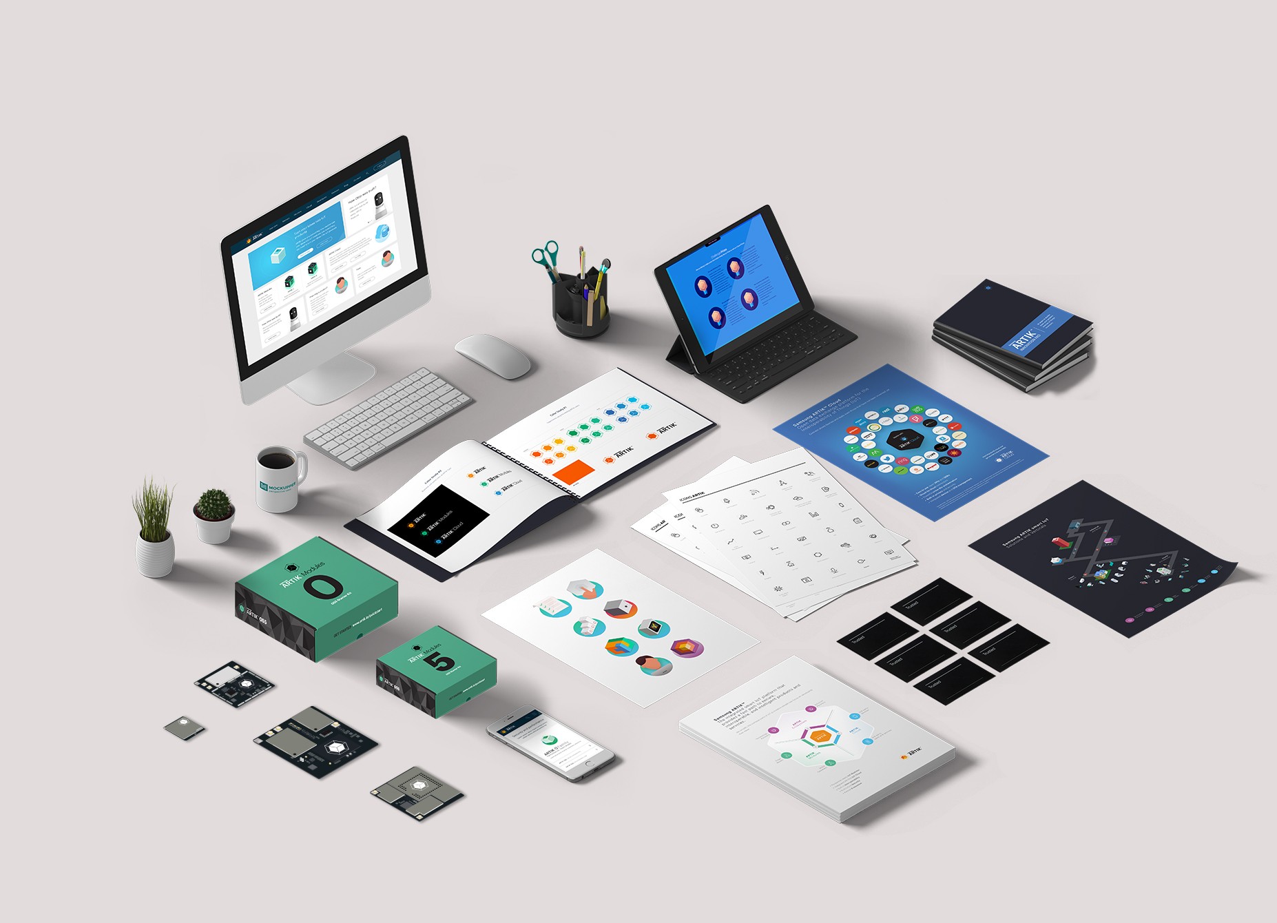
ARTIK was Samsung's IoT ecosystem that helped developers turn their products into smart products. Prior to rebranding the platform, ARTIK design initiatives were fragmented and decentralized, and nothing was consistent across brands.
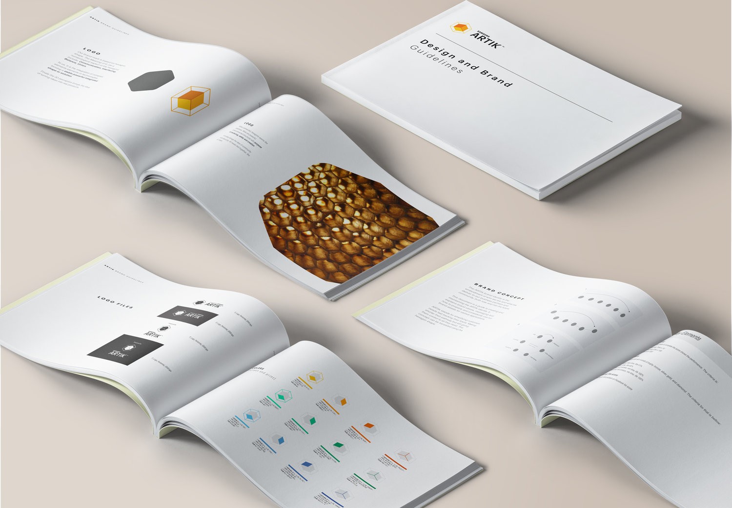
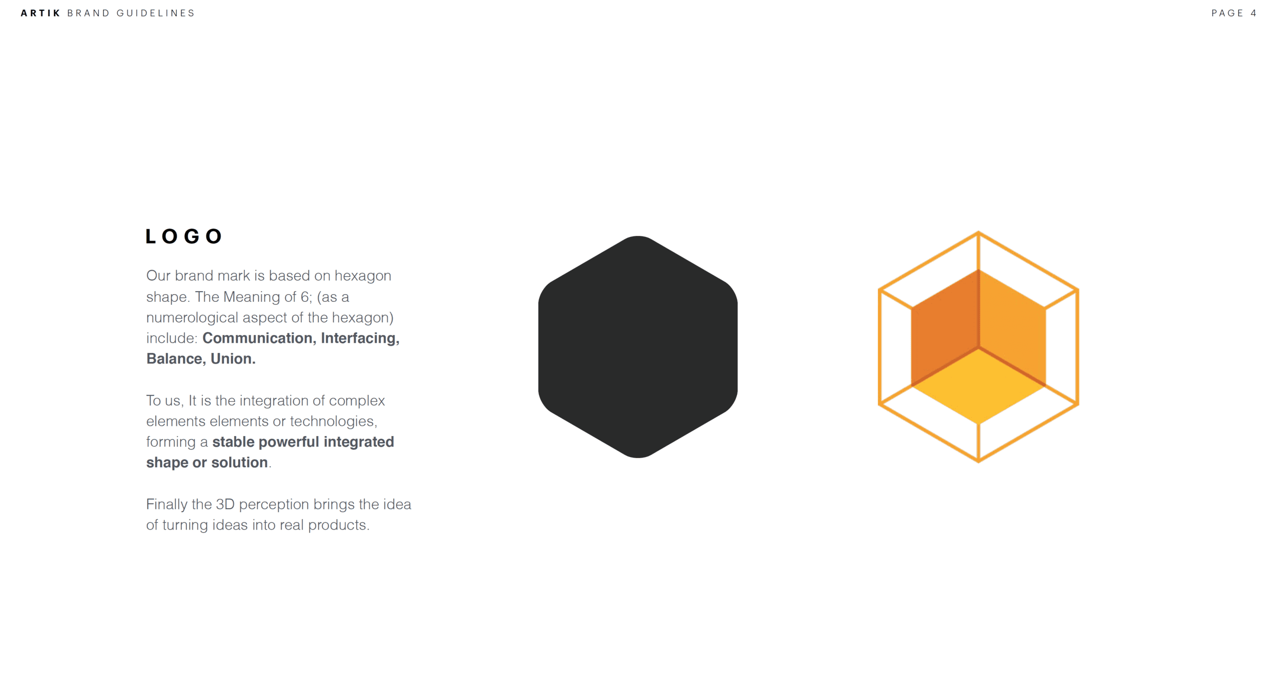
I spearheaded a full rebrand and built a cohesive new design system, from creating templates and visual guidelines for all touch points to designing logos, iconography, the website and app, marketing assets, collateral, and packaging. The final outcome was the ARTIK Brand Guidelines that could be leveraged by designers and agencies to ensure consistency and adherence to high-quality design standards.
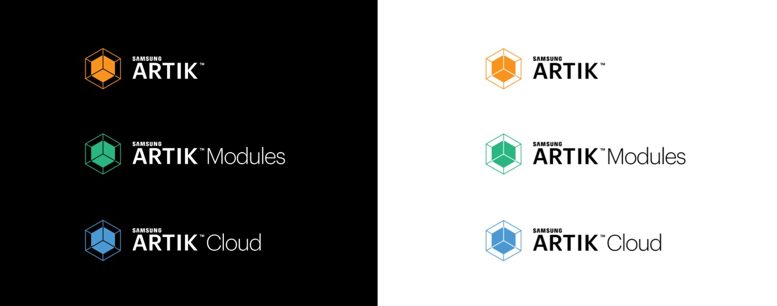
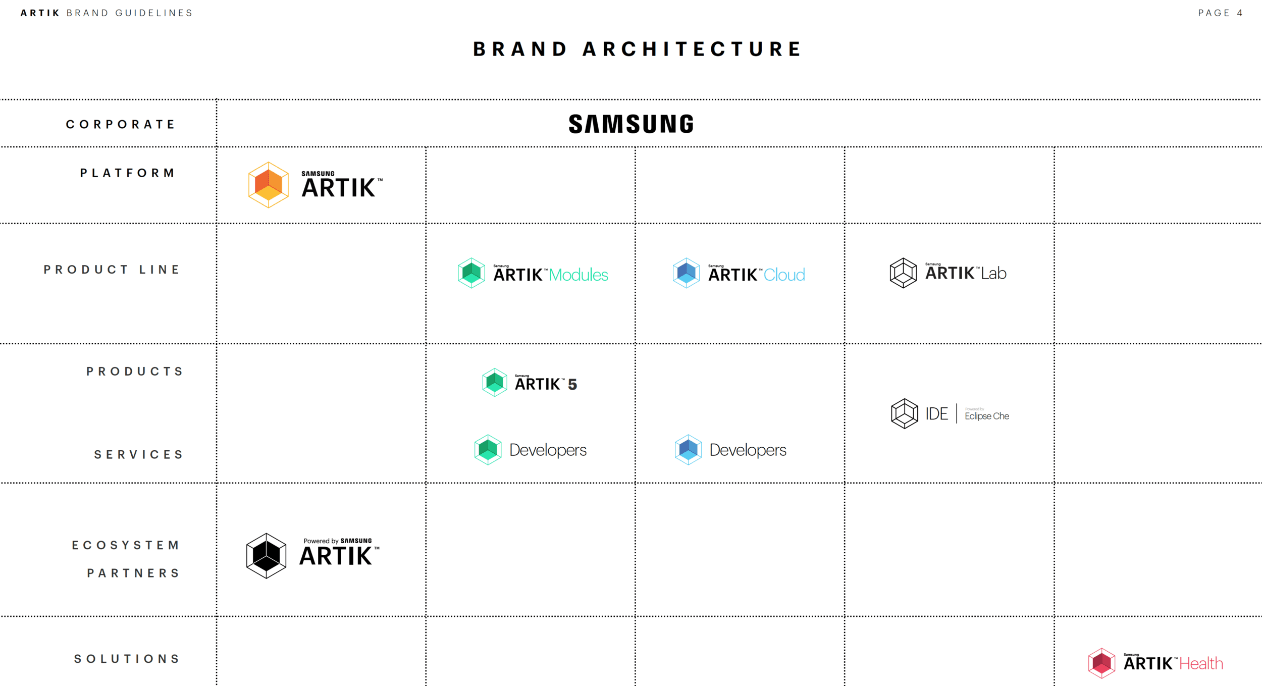
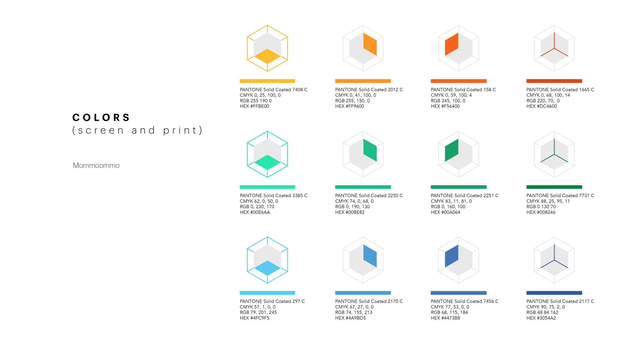
I was responsible for redefining Samsung ARTIK's logo lockups and colors. The previous versions were complex and unbalanced.
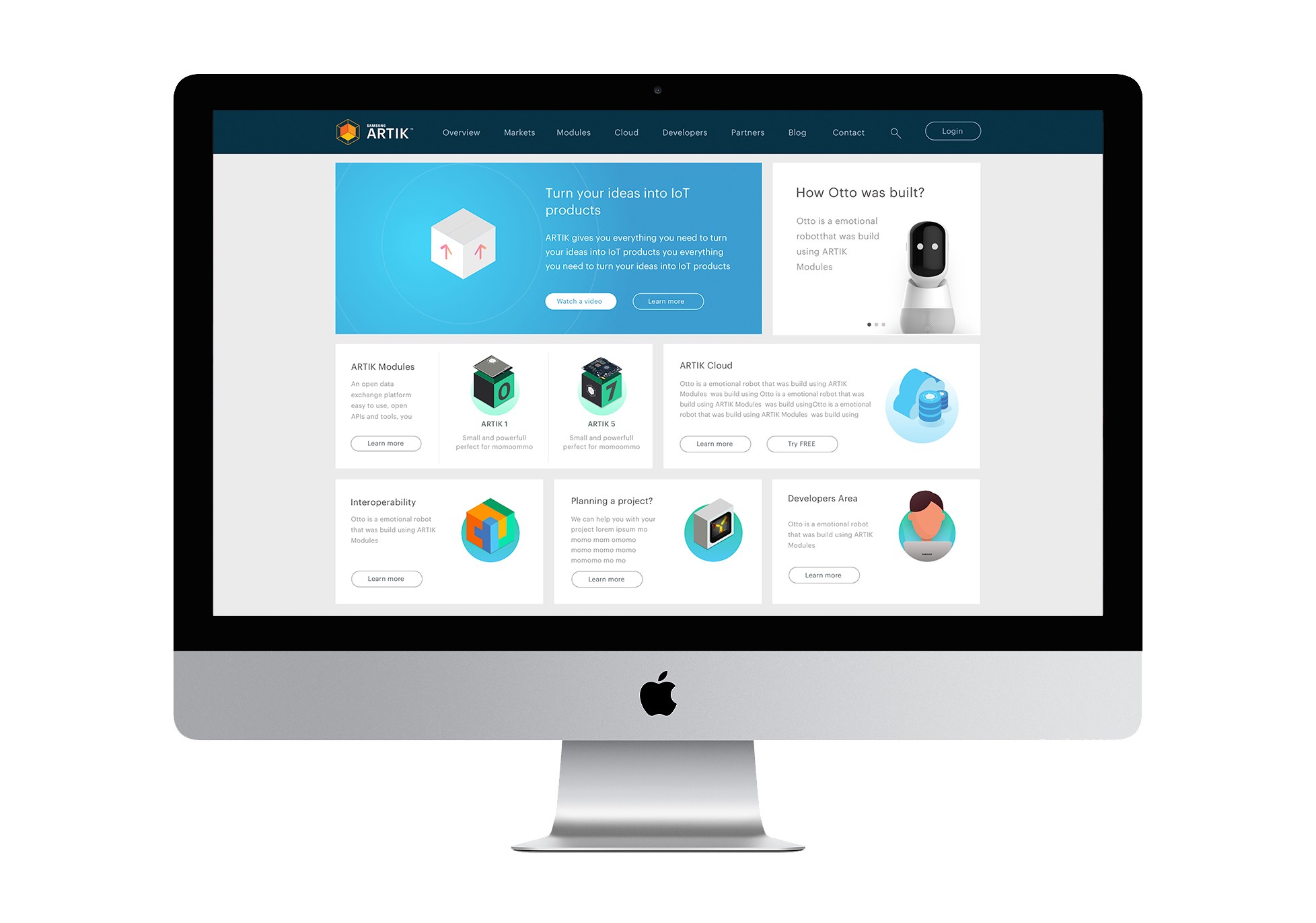
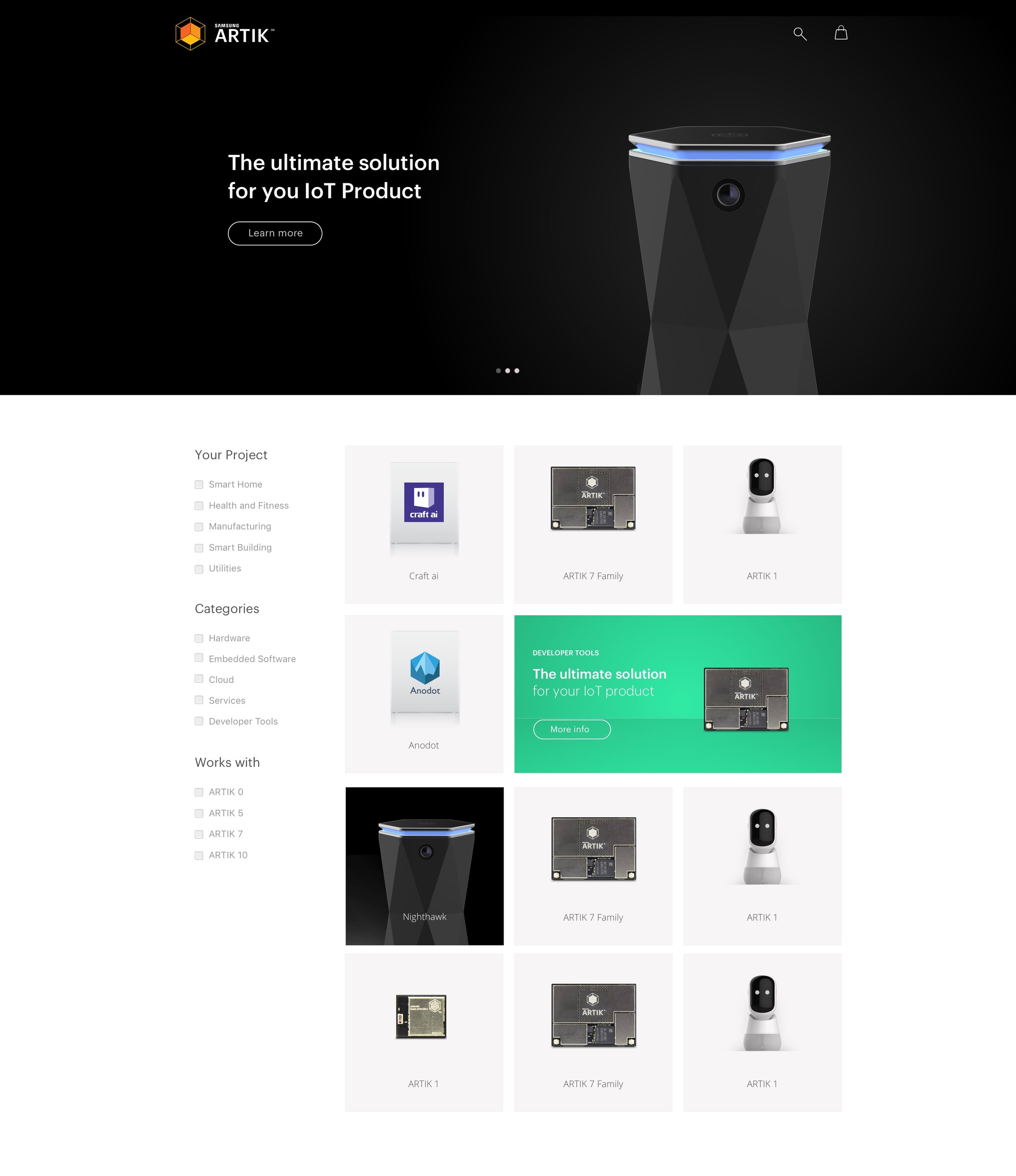
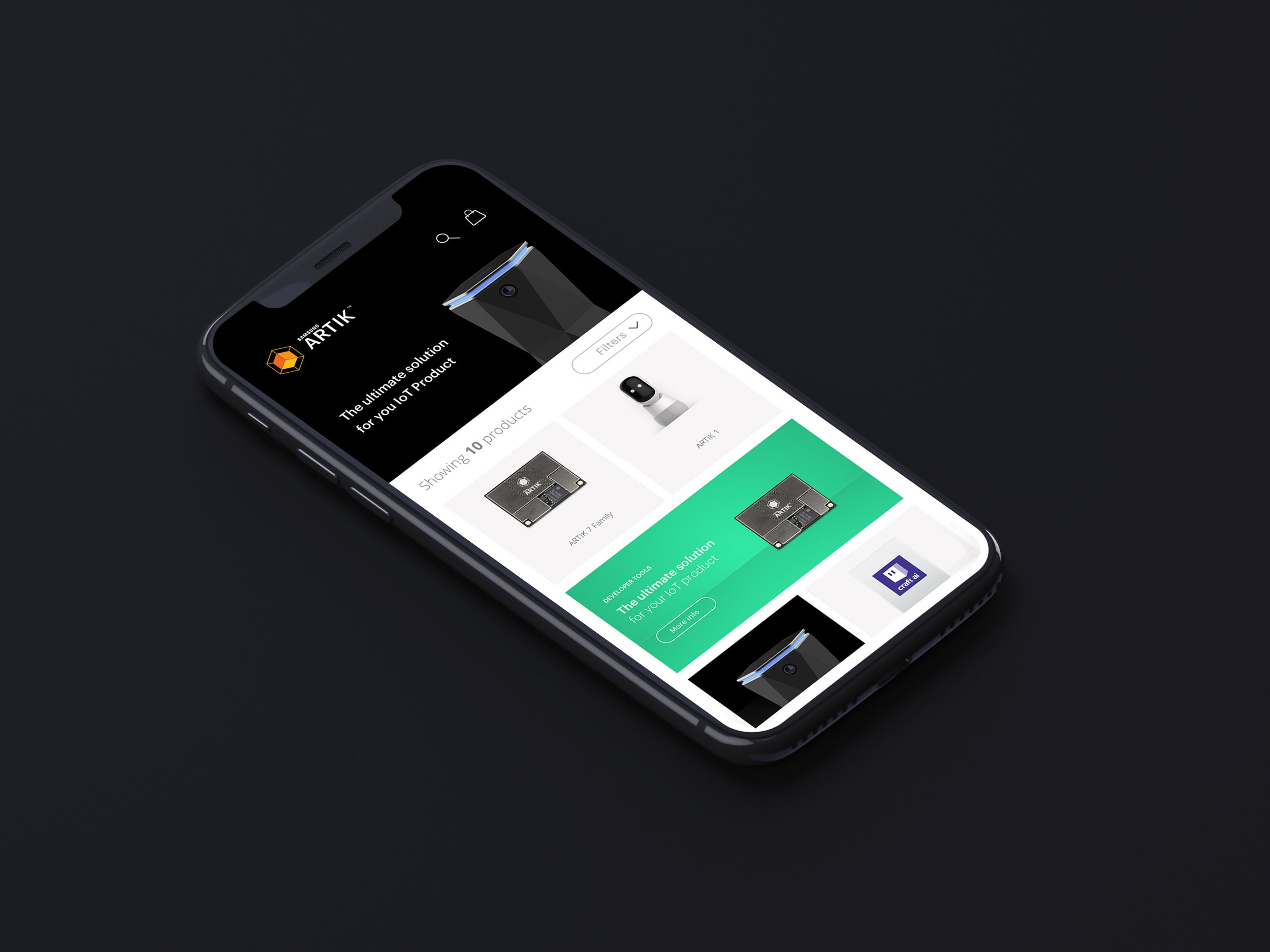
I created the ARTIK website, which served as the hub for all sub-brands and their respective products and services.
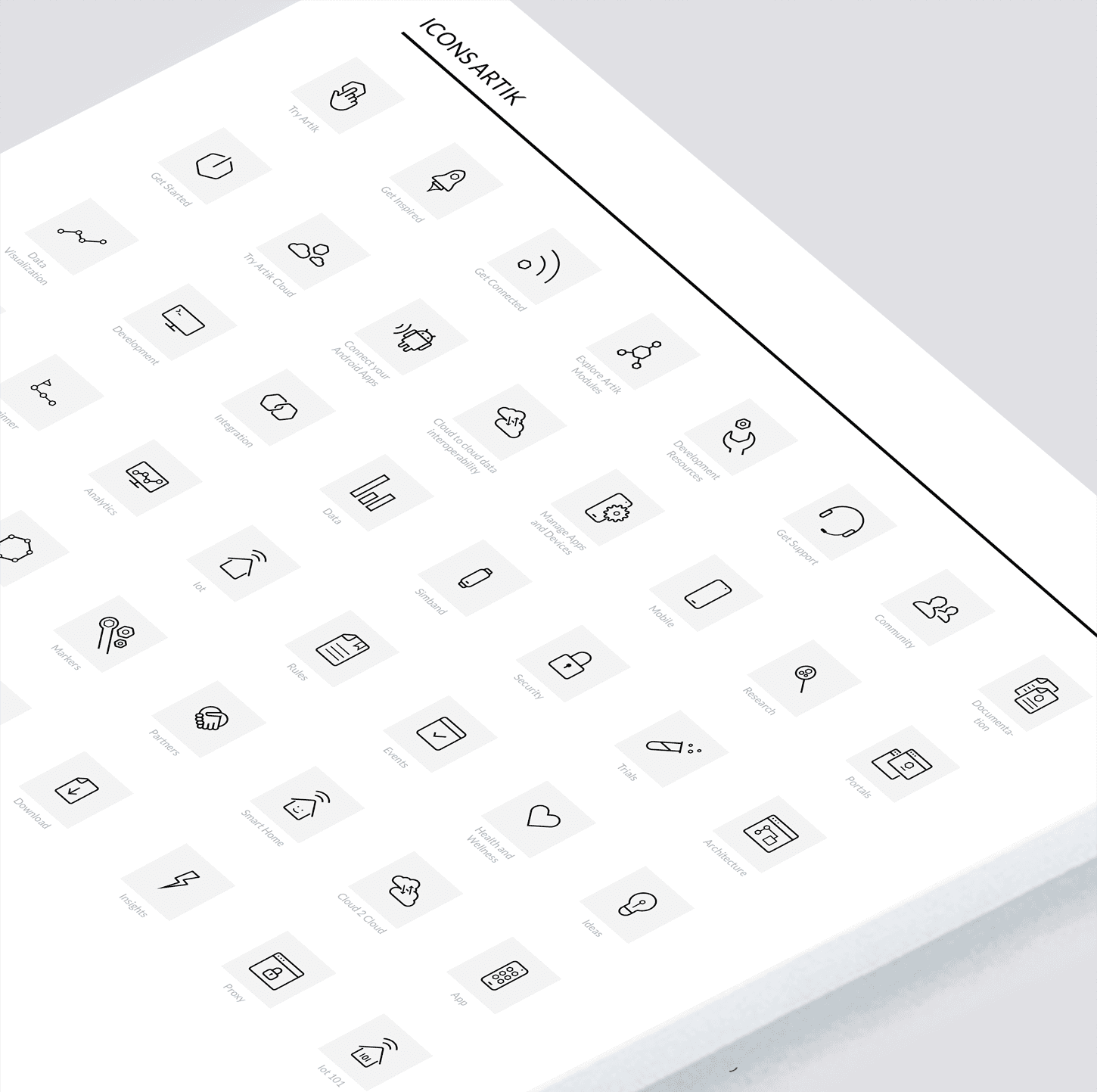
I defined a centralized library of icons to be shared with all designers and agencies working with ARTIK.
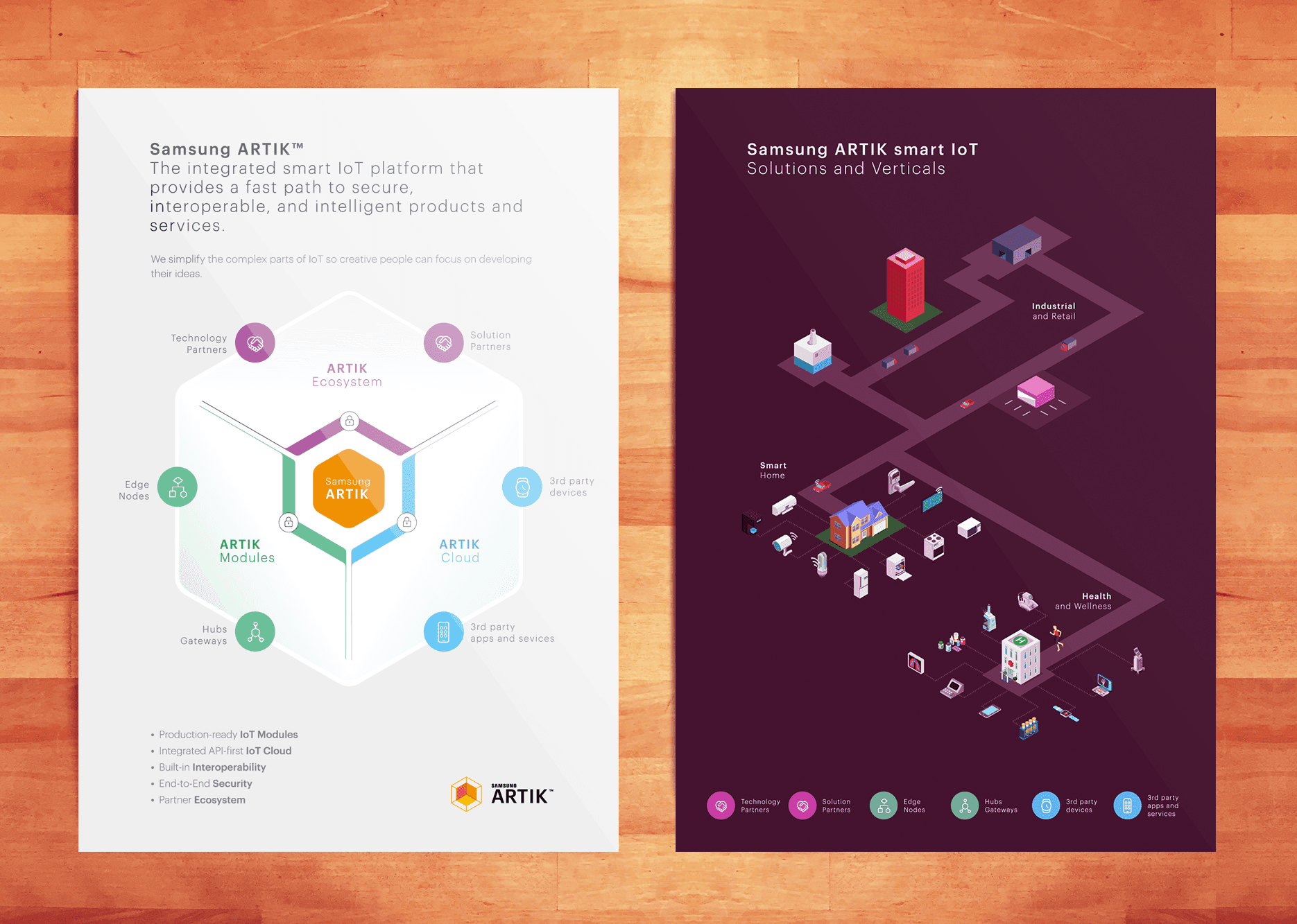
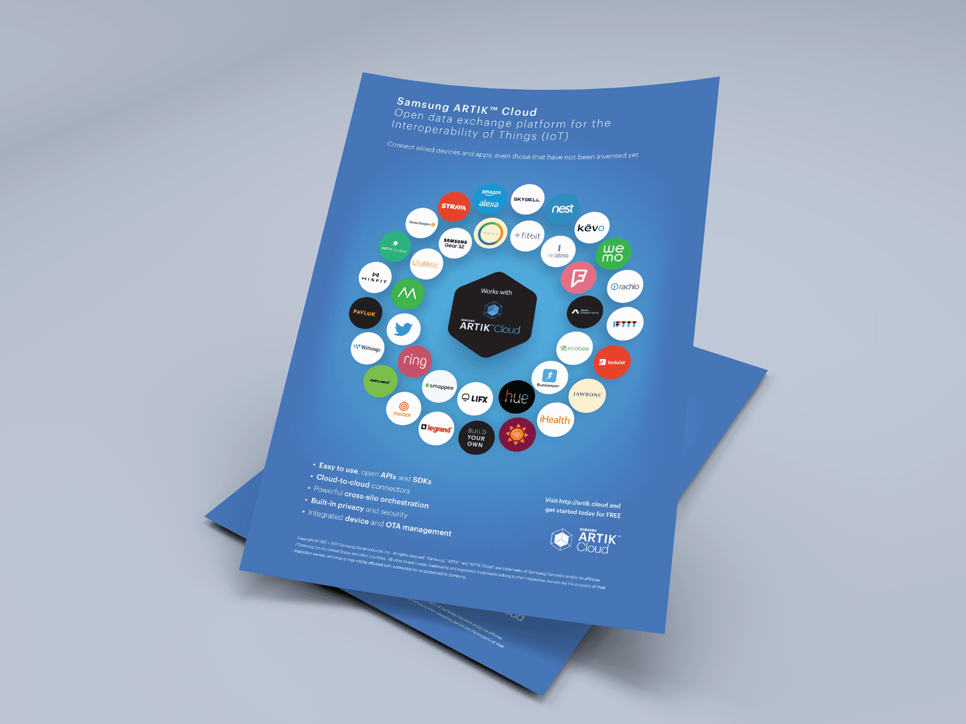
Part of the challenge was to create collaterals that would explain the complexity of the ecosystem and the technologies behind it in a simple way.
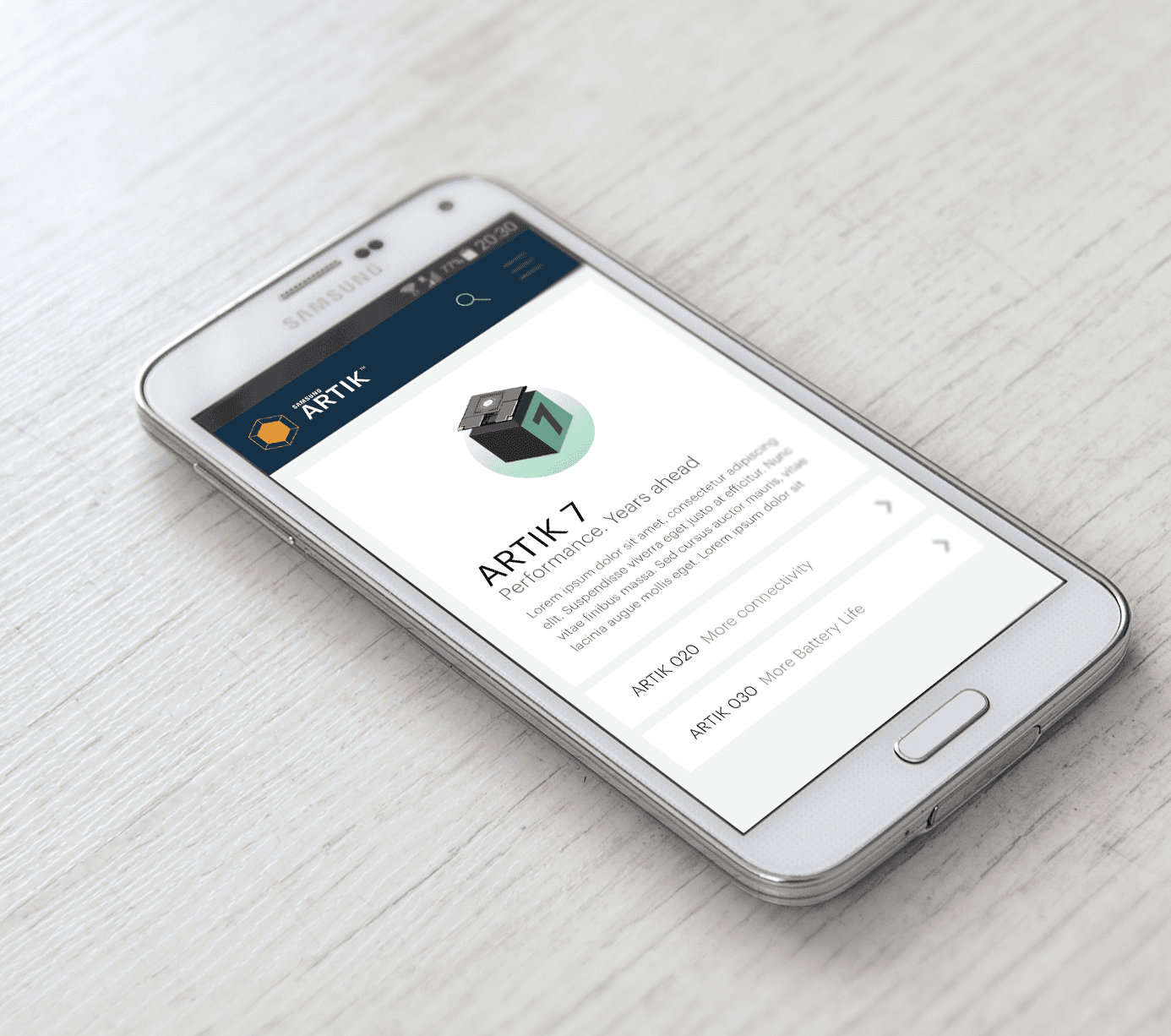
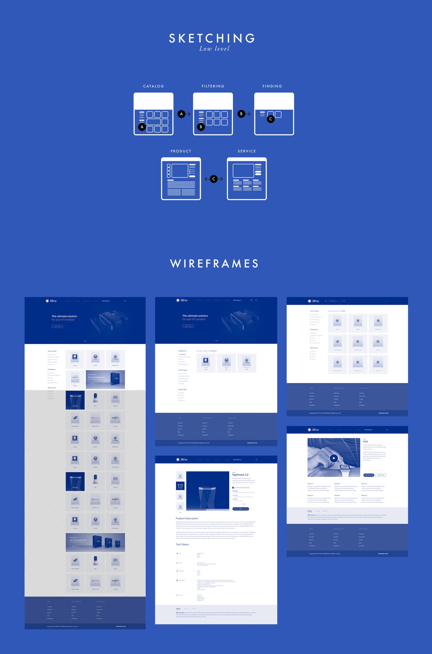
The marketplace is where developers could buy ARTIK modules to use in their IoT projects.
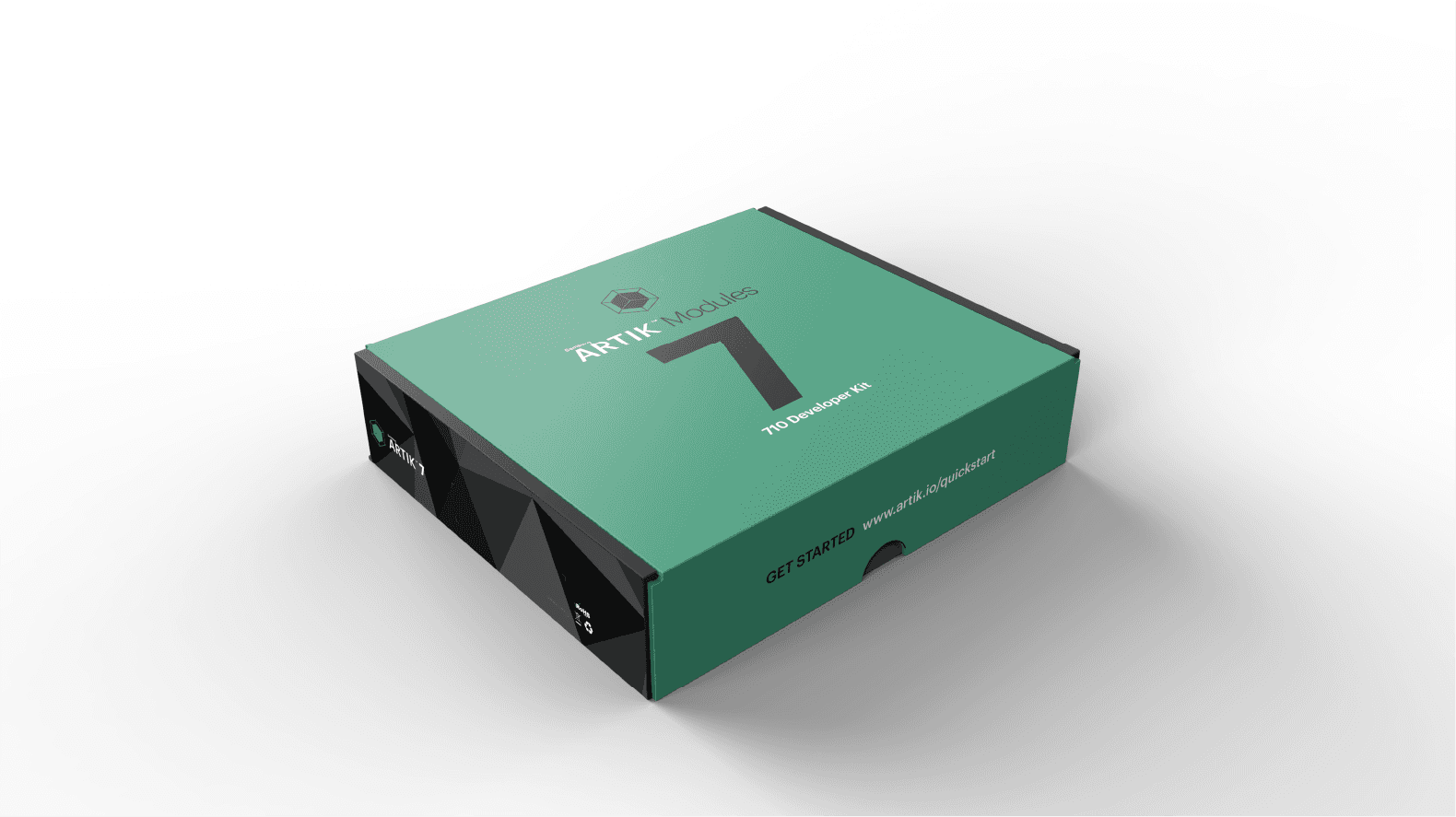
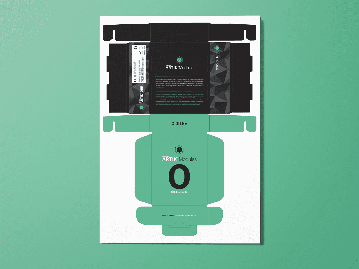
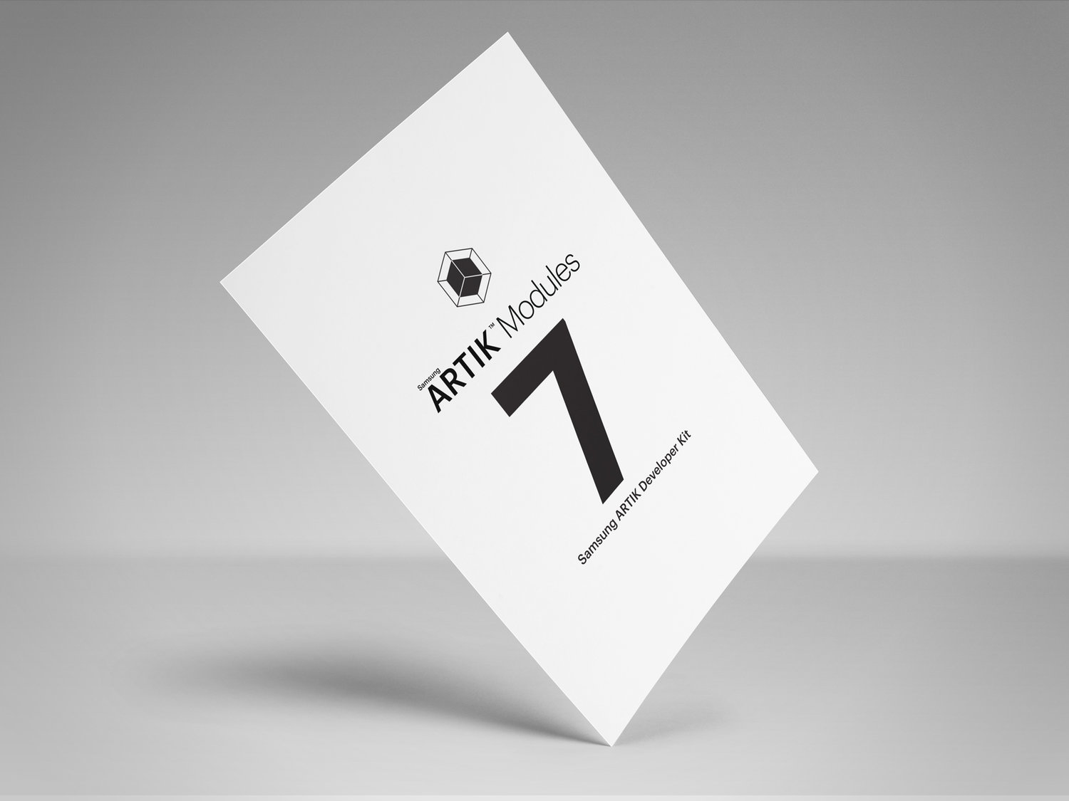
I had the opportunity to design some of the packaging for different modules.
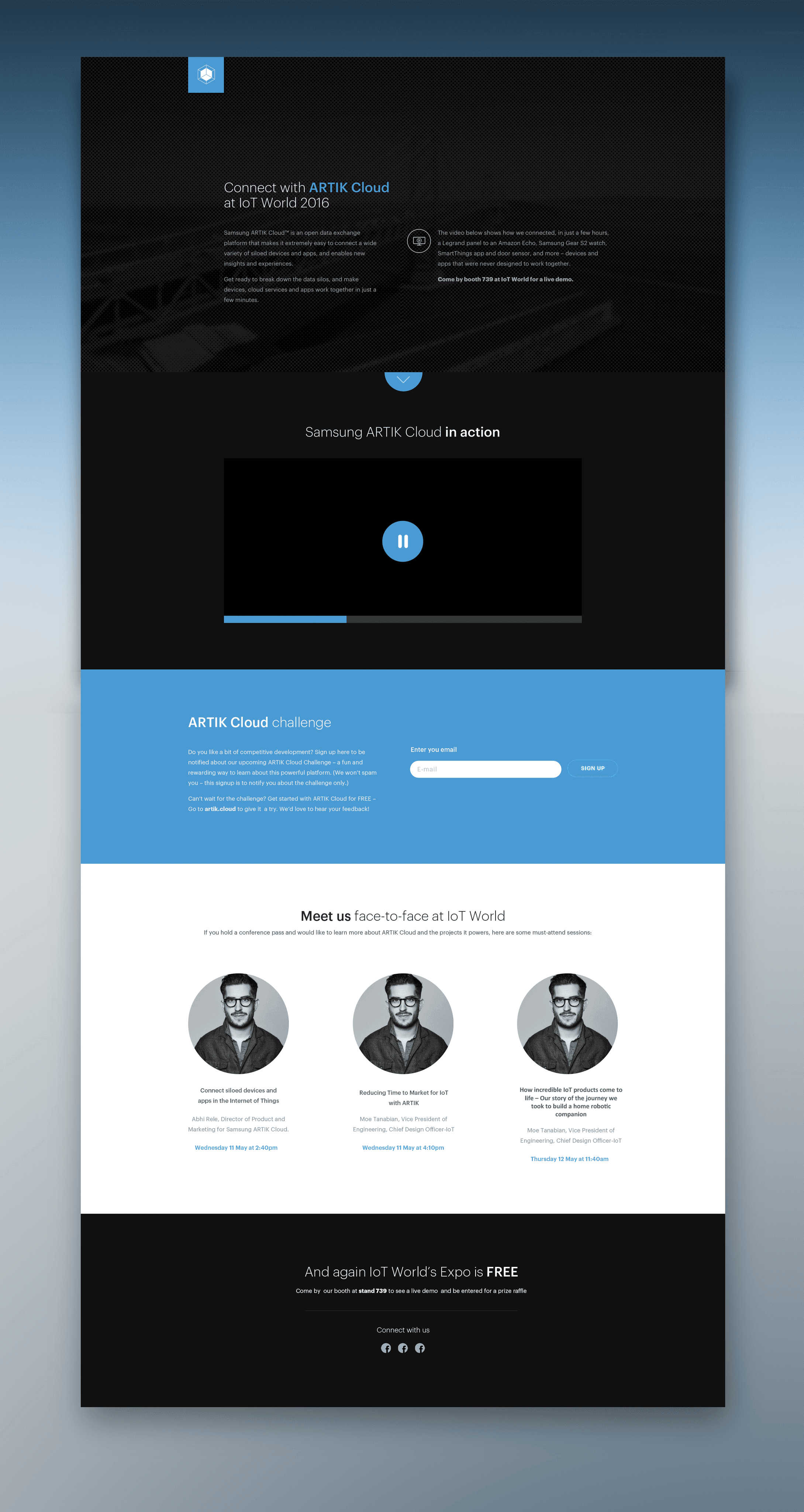
Every year, Samsung would participate in several events around the world to showcase Artik. This is an example of a page created exclusively for one of those events.
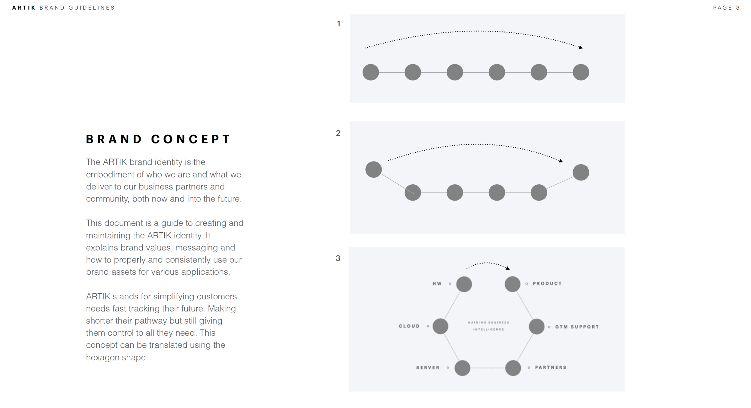
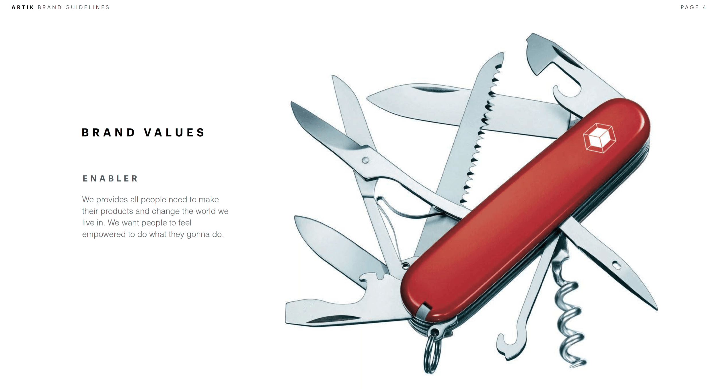
I led a workshop with the management team to define the brand values.
Here are examples of presentation decks I created to discuss brand concepts with Samsung management.
