Mira is a Brazilian digital influencer with a mission to help individuals achieve financial independence by leveraging his proven framework. I led end-to-end design and built Comunidade Mira, a mobile app that helped Mira successfully expand his business, ultimately leading to it being featured on Shark Tank Brazil.
Mira, a renowned Brazilian digital influencer, has been guiding people on their journey to financial management for decades. Over the past few years, he has assisted more than 40,000 individuals in achieving financial independence. During this period, he has been developing a highly effective framework.
For years, Mira has been eager to develop an app to expand his business and reach a broader audience. My challenge was to thoroughly understand his business framework and create a user experience that enabled individuals to effectively navigate toward a path of financial independence.
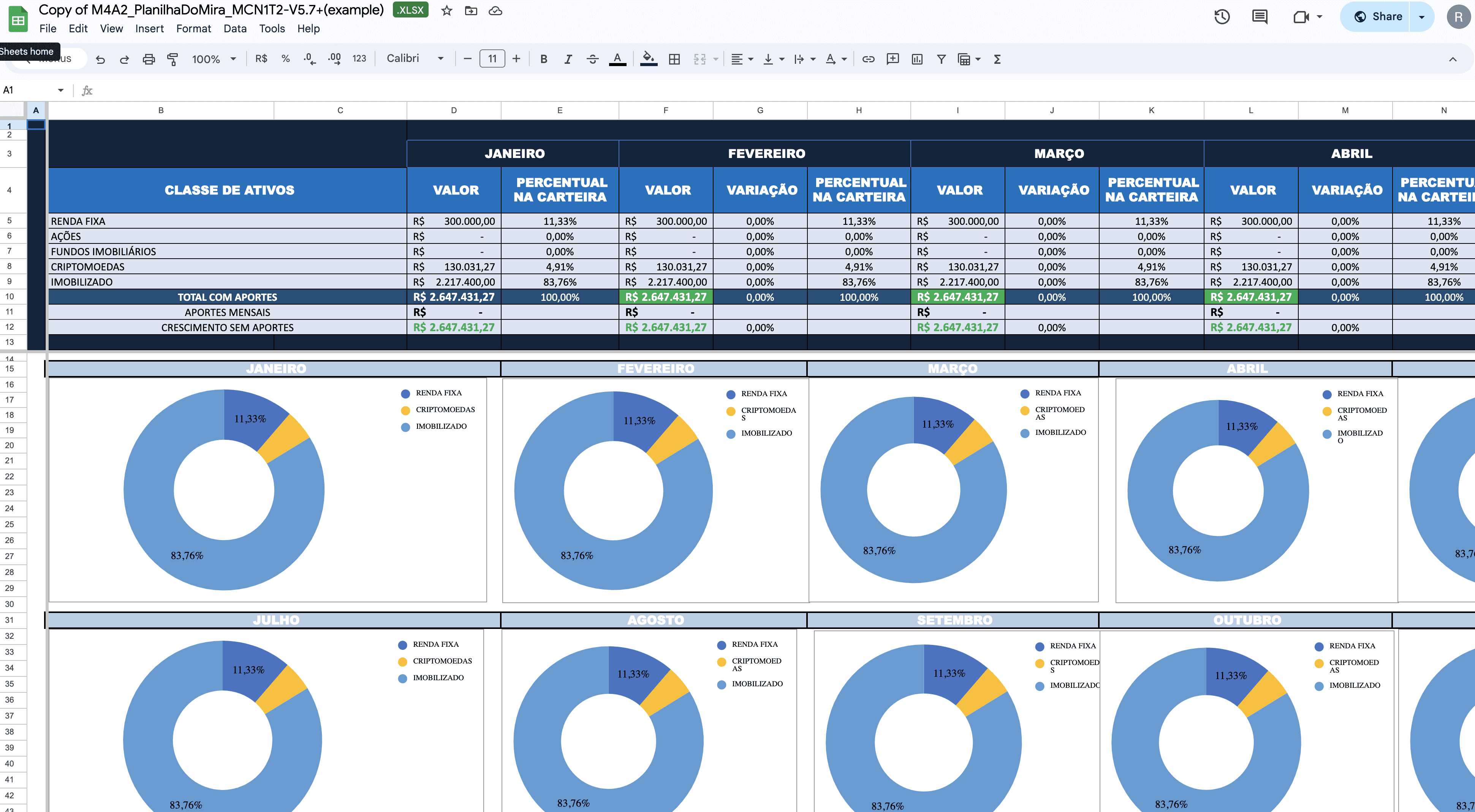
Mira has utilized a meticulously crafted and complex spreadsheet to educate his students. I needed to fully comprehend all its formulas and nuances to use it as a reference for beginning the app's development.
After thoroughly understanding the spreadsheet, I chose to skip initial research and directly begin sketching initial flows to start ideating, given the proven success of his method.
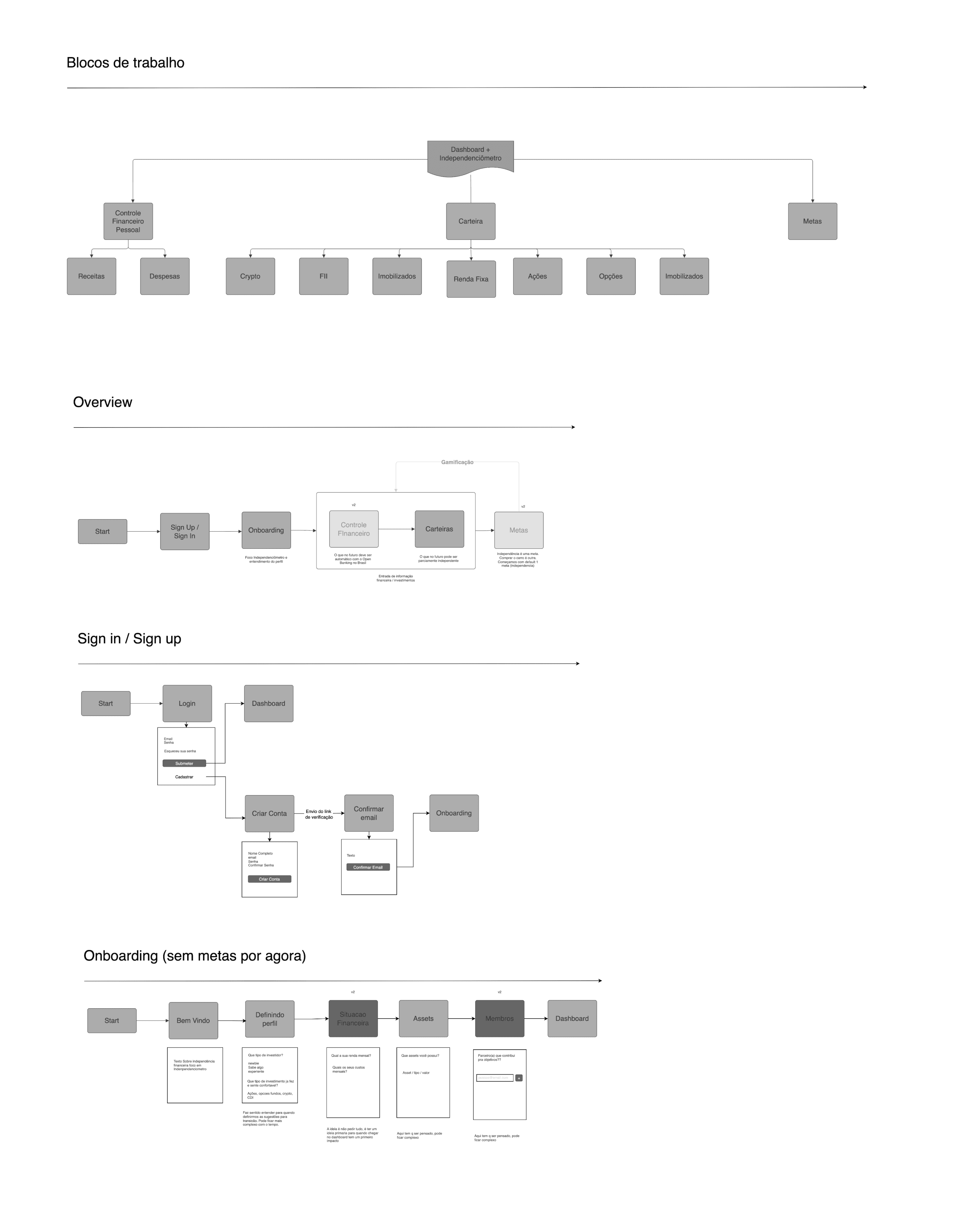
Breaking down the sections and creating flows based on the information in the spreadsheet provided a high-level understanding of the necessary tasks.
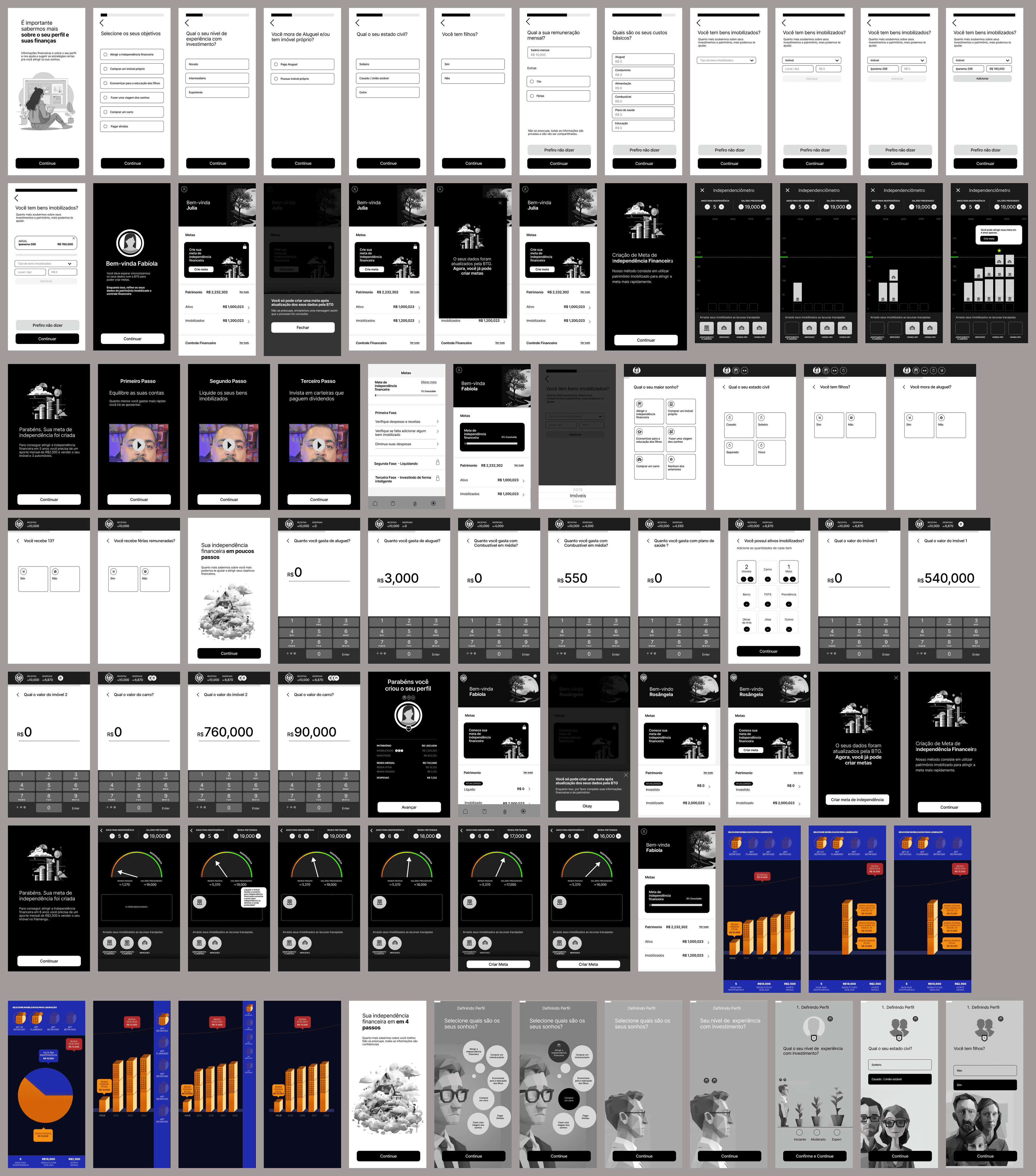
This is a small part of a very extensive exploration that originated with 6 different concepts and hundreds of screens that would be narrowed down to 3 concepts so we could test with users and get their insights.
I tested 3 different concepts with 12 people. In each session a person would answer questions and navigate through 2 different concepts.
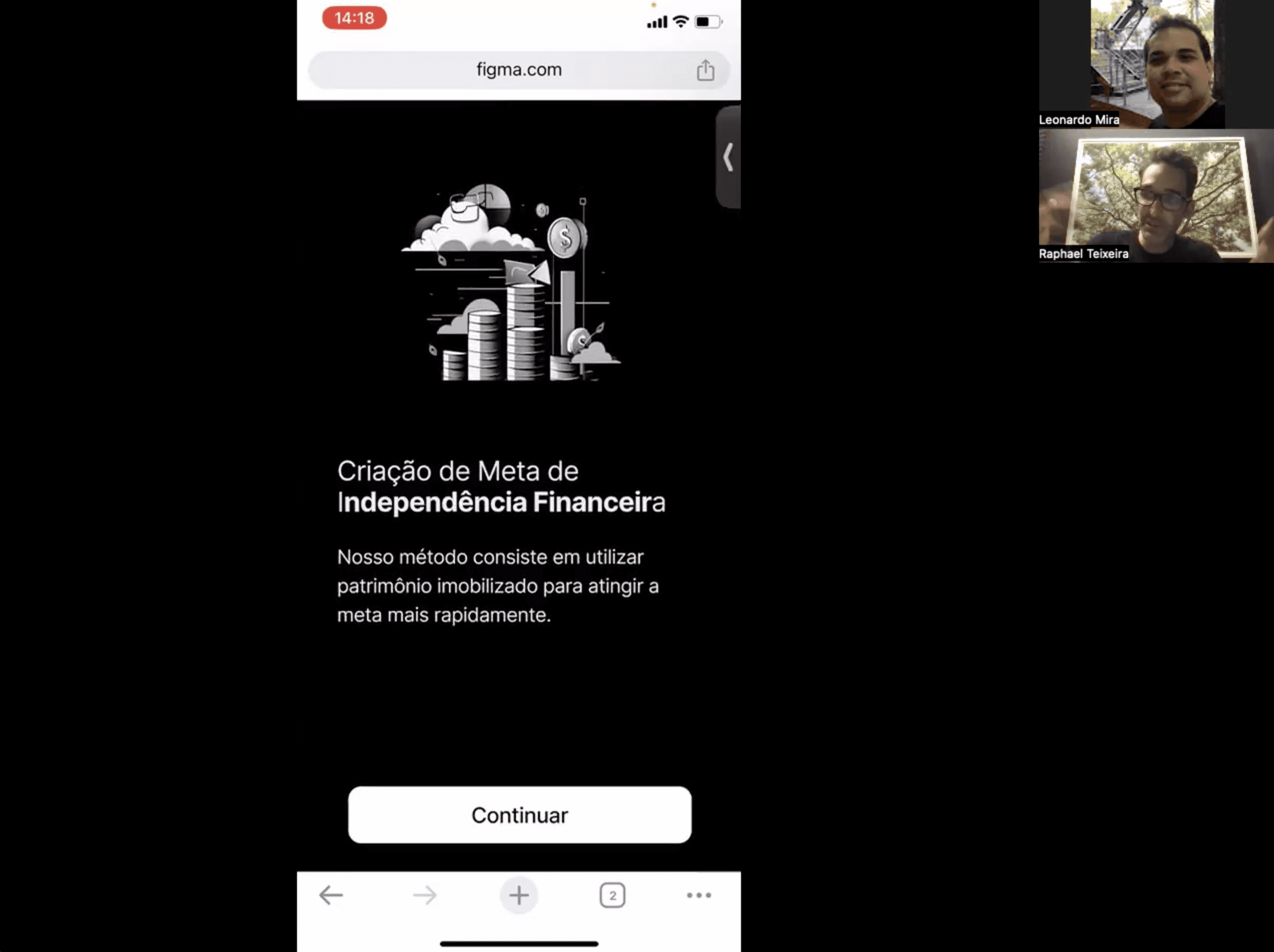
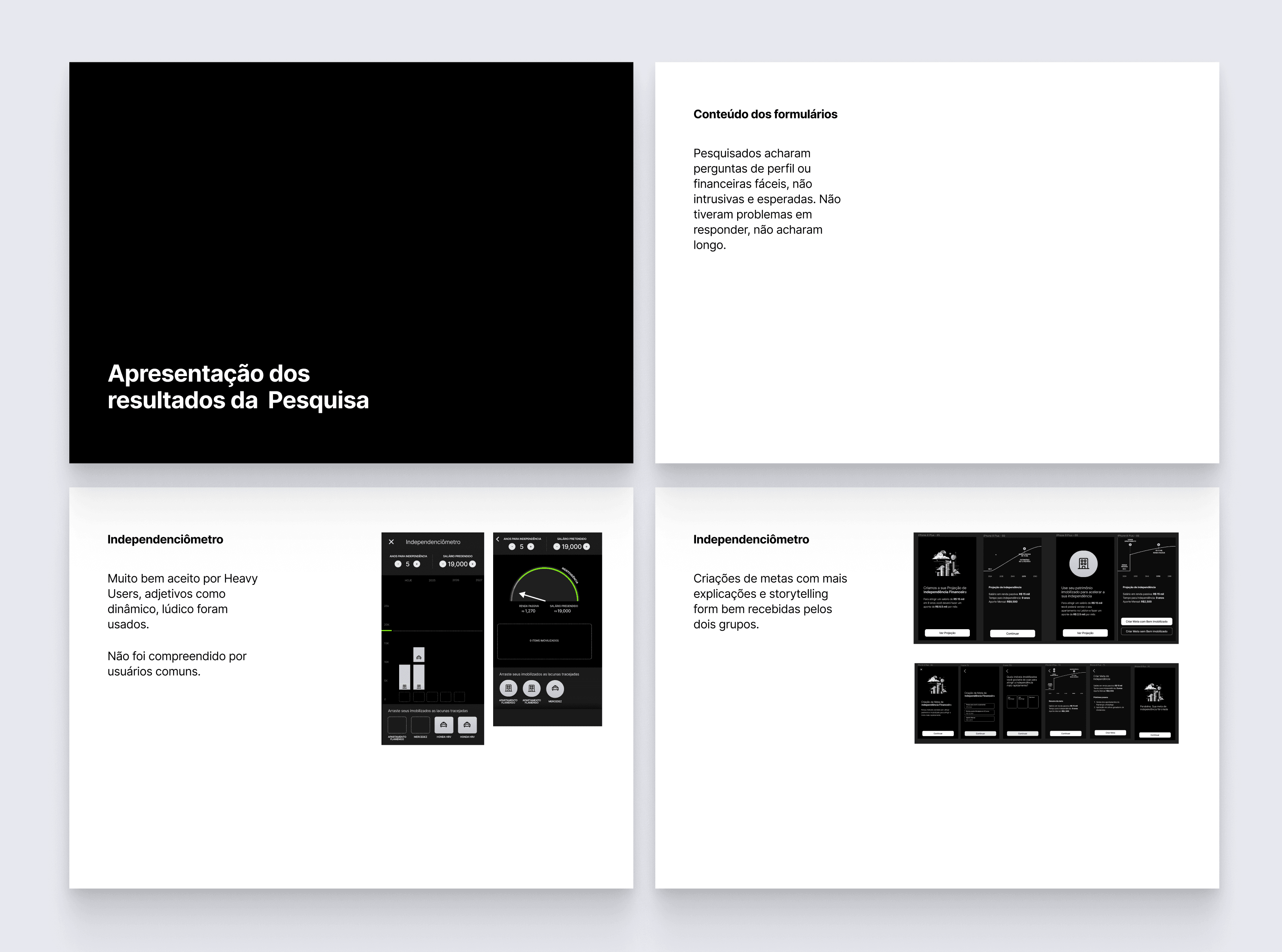
Coming out of the research, I created a document with all of the learnings and presented it to the team. Here were some of the most important insights:
1) People did not care about the financial part of the onboarding being long. In fact they wanted it to be complete.
2) Breaking down the onboarding into multiple parts and sharing insights along the way was engaging and useful to help build the story and foster education.
3) The initial version of the Independence Goal Simulator should be simplified, utilizing common language and straightforward elements like basic bars, making it easier for users to understand.
4) Some terms were not clear to users and needed further clarification.
We incorporated the learnings into a final version and did a few more sessions of user testing to validate the final prototypes.
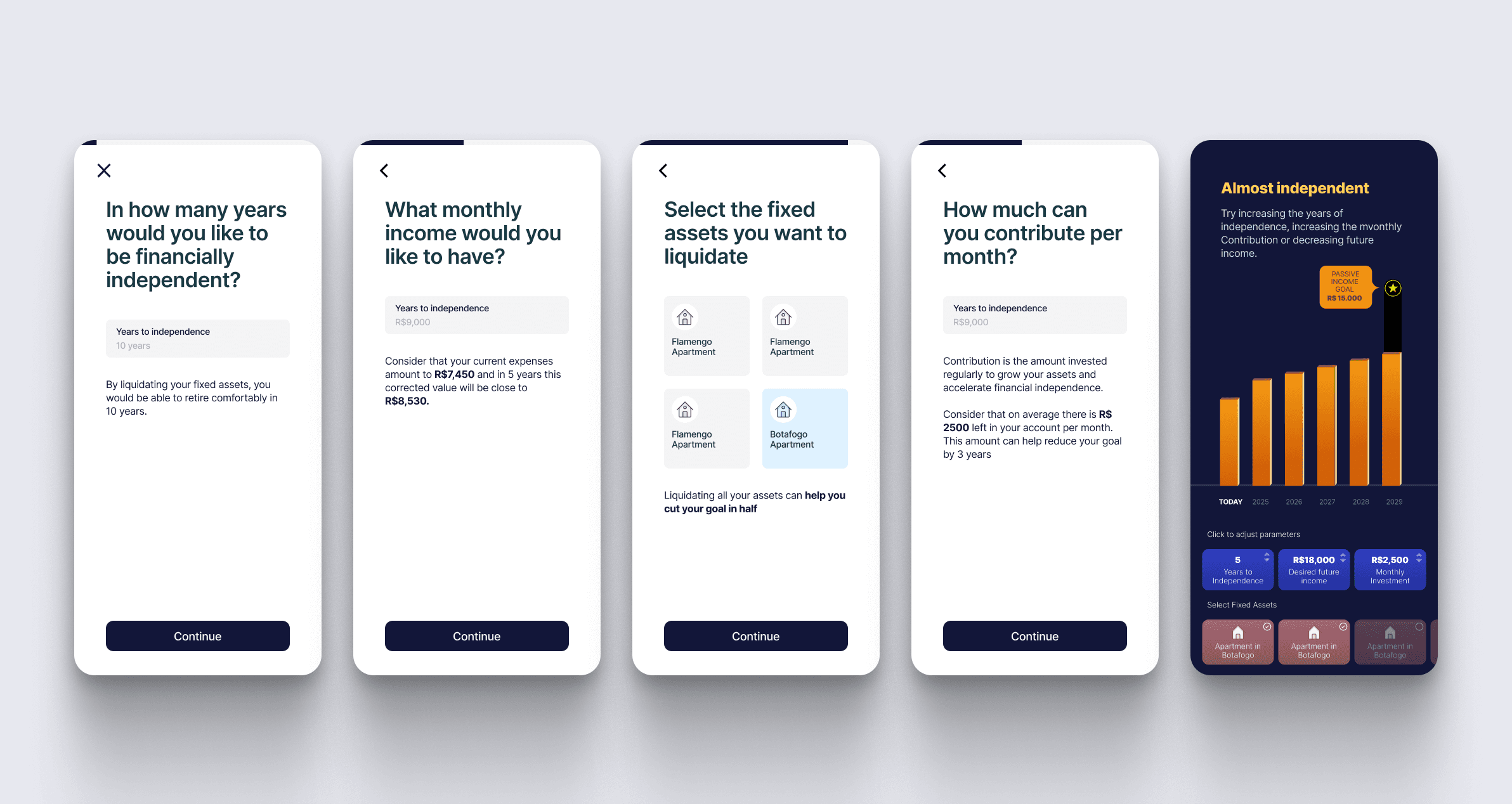
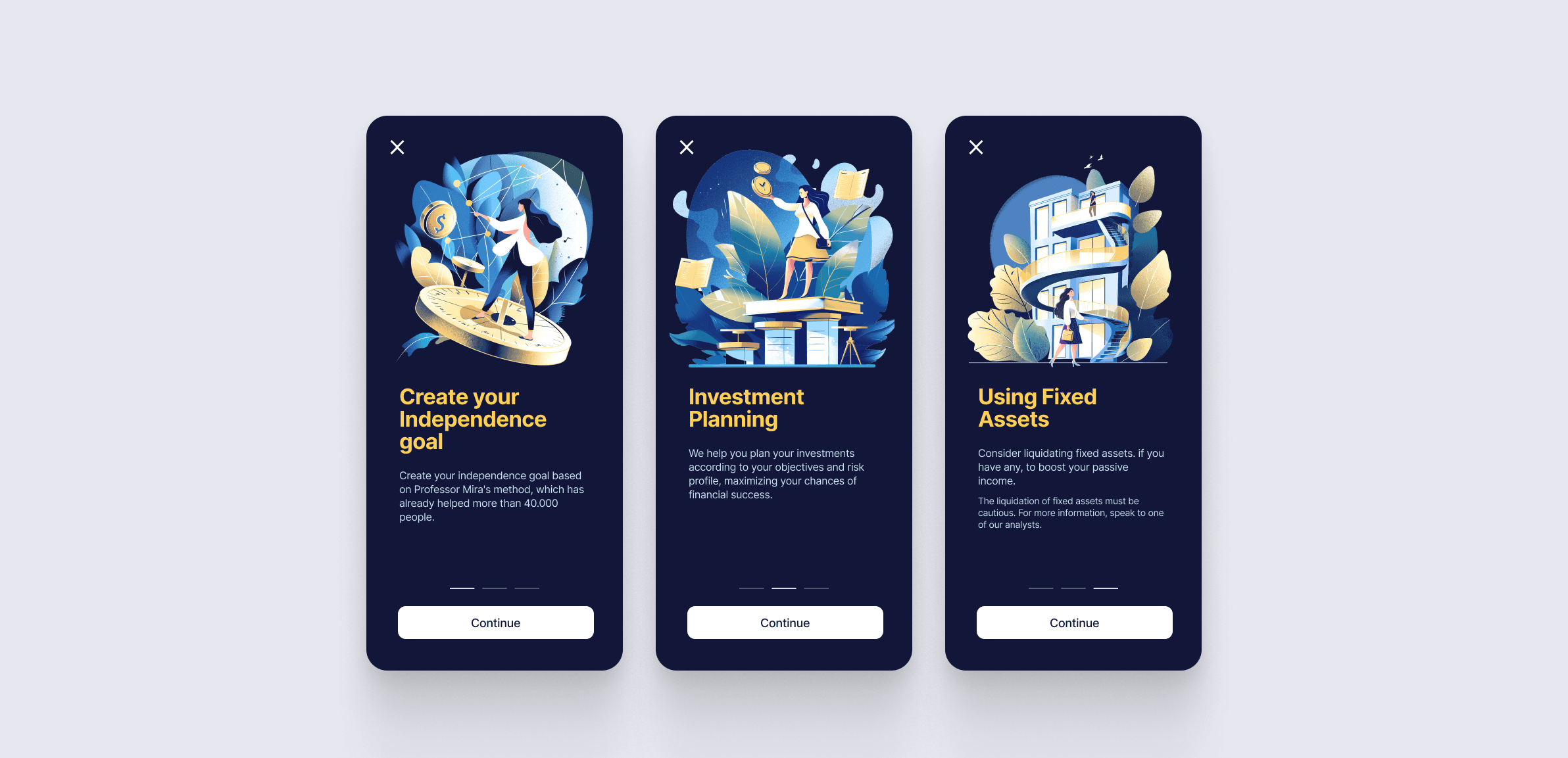
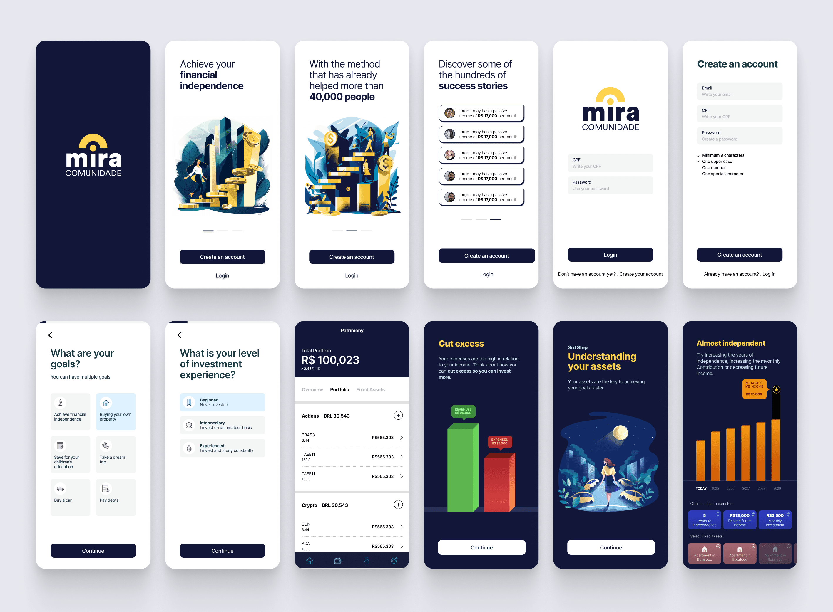
The onboarding for goal creation is not any form, the help text gives hints to set a reference so people can make their decisions. Those hints are based on the information we already have in our database. We also, again, take the opportunity to show the impact of liquidating fixed assets.
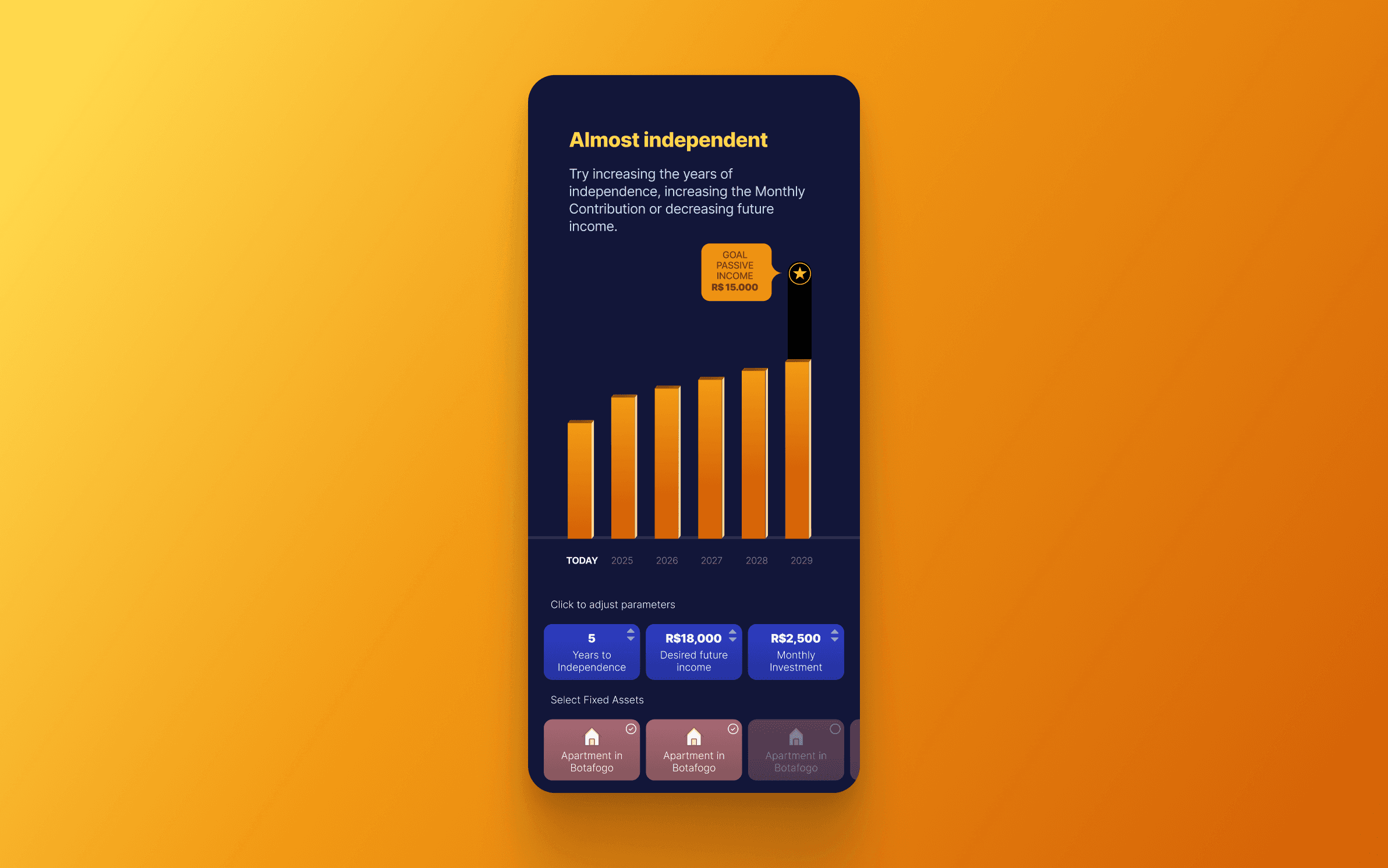
On the Goal Setting Simulator or, the Independeceometer, users can change all of the parameters previously added on the onboarding flow, but now they can see the effects of their actions more clearly. This redundancy helps to make the app accessible for normal and savvy users.
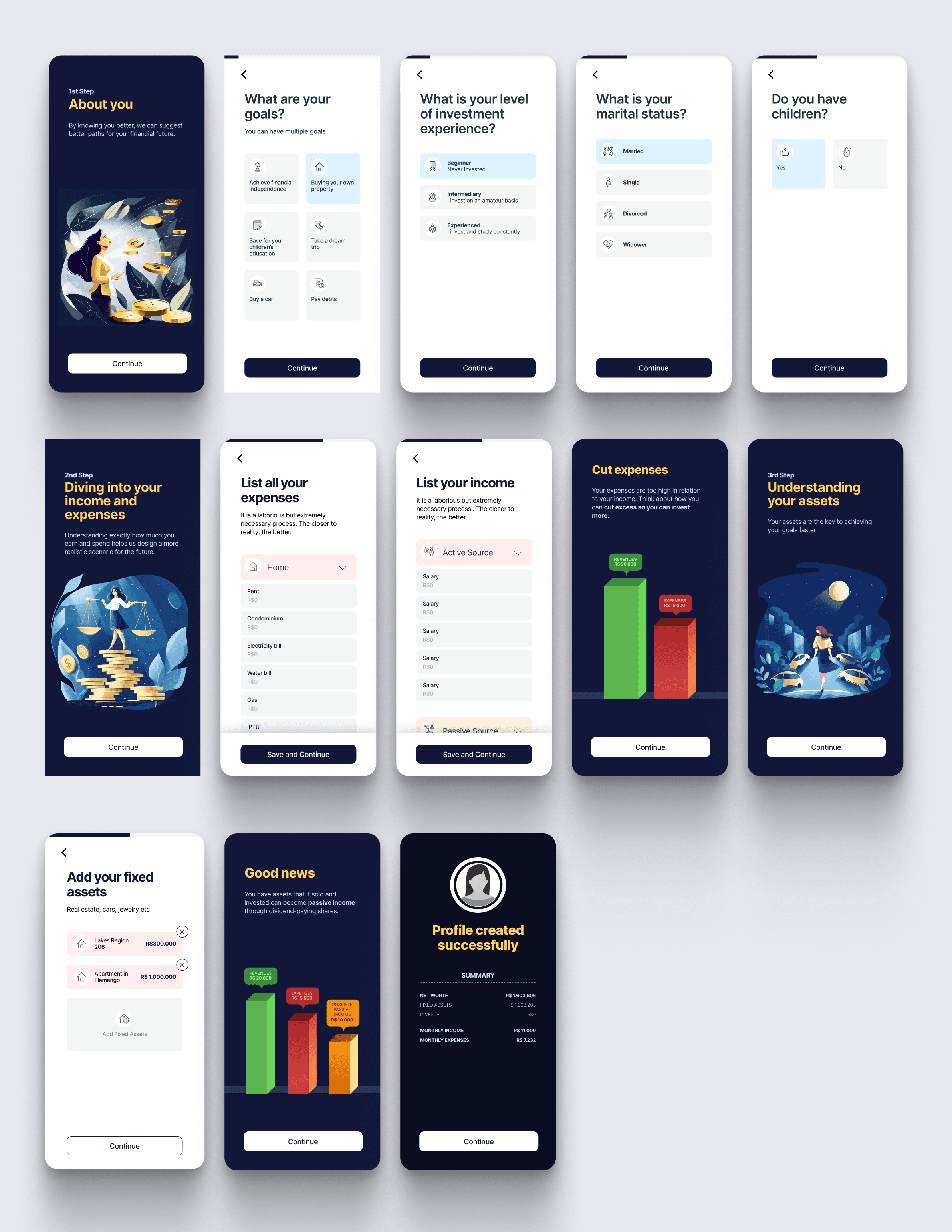
The onboarding was divided in 3 steps. The first one to understand more about the investor profile, the second to collect all of the expenses and income, and the third to know more about user assets. Because it is fairly long form, after the end of the step, we bring useful insights for users. Those insights also help to build a narrative explaining step-by-step the framework of investment.
It is important to understand that in Brazil there are still no solutions to connect applications to bank accounts like Plaid. However, it is in the process of being developed and will be available soon, so we can significantly reduce the number of steps in the flow.
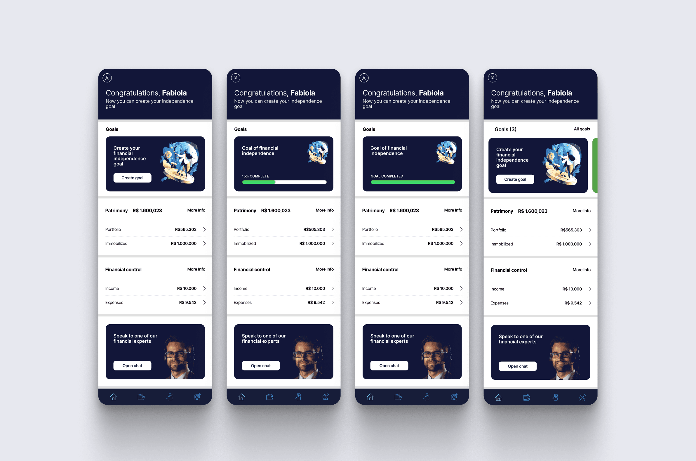
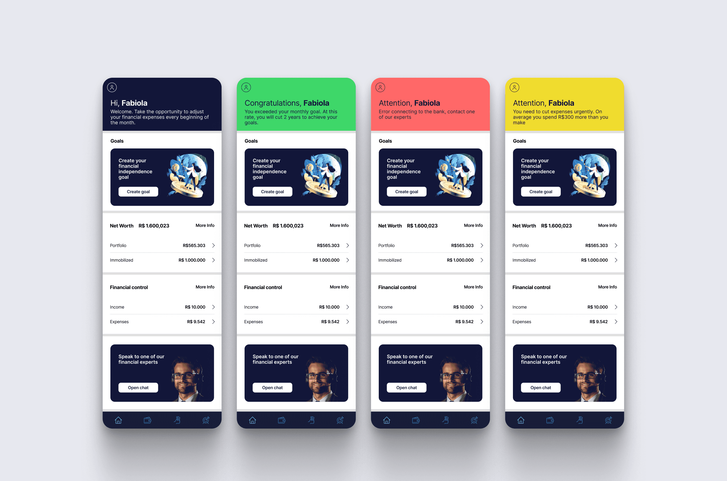
In the dashboard, users are provided with an overview of all of the necessary information required for them to achieve their goals. The heart of the app is goal creation and tracking, which is located right underneath the notifications.
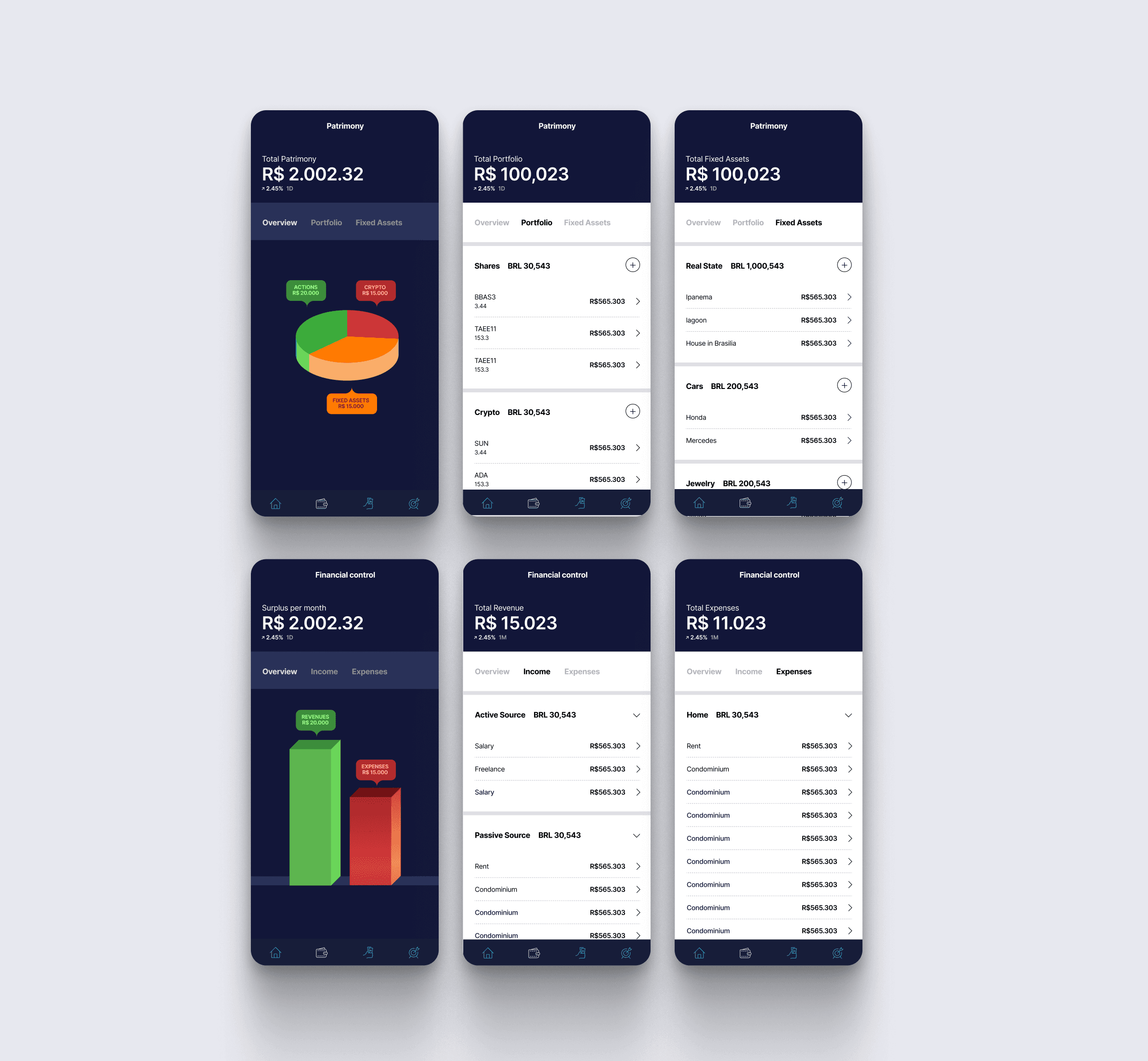
Users can also view a summary of how your assets are performing along with their income and expenses.
The top bar is where the notification center is located. We see this more as a space for deeper communication with users and in the future, where AI will help bring valuable insights that motivate users to perform tasks that will help them achieve their goals faster.
The premise of Mira's framework is that investors should think about liquidating fixed assets, so they can achieve financial independence faster. The majority of people don’t want to sell the place they live or expensive cards they always dreamed of having.
One more time we take a opportunity to introduce that idea and push people to try and simulate how much faster they could achieve their financial independence if they follow the strategy.
User can follow their investment performances through their patrimony area and control their finances by accessing the Financial Control area.
I had the opportunity to not only design and research the app but also create the logo, visual identity, and overall visual design of the app.
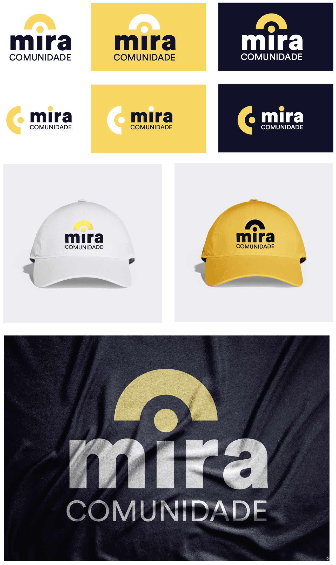
The word "Mira" means target, so Mira requested me to incorporate a target into his logo to related back to the name.
The use of blue and yellow gold in the brand design is strategic and impactful. Blue, a color associated with trust, reliability, and professionalism, conveys the company's stability and dependability, reassuring clients that their investments are in safe hands.
Complementing blue, yellow gold symbolizes wealth, prosperity, and success, visually reinforcing the company's mission to help clients achieve financial freedom. It adds a touch of luxury and exclusivity, suggesting high-quality services, while also bringing an element of optimism and energy.
The visual design strategy combines a clean, sophisticated aesthetic with rich, personality-filled illustrations and graphs. This contrast is designed to inspire users on their journey toward financial independence.
Gold, prominently featured in all illustrations and graphs, serves as a metaphor for achieving financial success.
An extensive use of white and neutral tones ensures a distraction-free experience as users navigate forms and contrasts with the dark blue background.
Duotone icon style adds more personality and visual interest, particularly when applied in long forms.
